Colour is a powerful tool that has the ability to evoke emotions, influence moods, and shape our perceptions of the world around us. In the realm of branding and graphic design, understanding the principles of colour psychology can be instrumental in creating successful and impactful brand identities. This blog explores the fascinating world of colour psychology, its effects on behaviours and perceptions, and its relationship to playful and confident branding in the realm of graphic design.
Perceptions
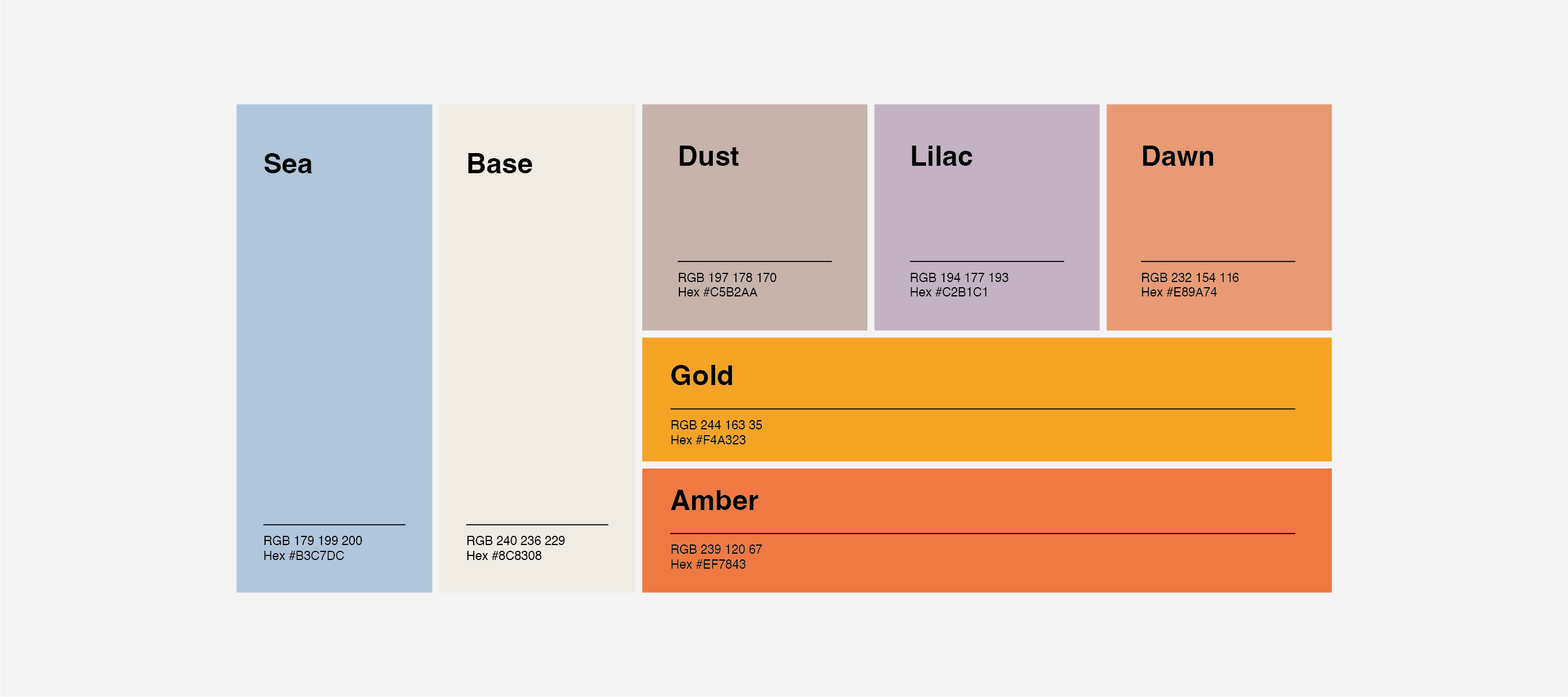
Colours are not only visually stimulating but also carry cultural and personal associations that can influence how individuals perceive and interpret them. For example, the colour red is commonly associated with passion, energy, and excitement, while blue is often associated with calmness, trust, and reliability. Understanding these associations can help graphic designers strategically select colours that align with their desired brand message.
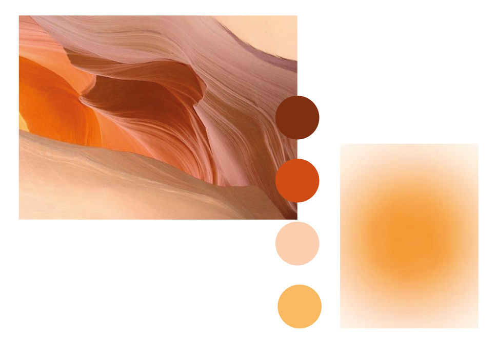
Different colours have the power to evoke specific emotions and moods in individuals. Warm colours such as red, orange, and yellow tend to elicit feelings of warmth, energy, and enthusiasm. On the other hand, cool colours like blue, green, and purple evoke a sense of calmness, tranquillity, and relaxation. Harnessing the emotional impact of colours can be vital in creating brand identities that resonate with the target audience.
Colours have the ability to capture attention and influence perception. Bright, vibrant hues are more likely to attract attention, while softer pastel shades may evoke a sense of delicacy or elegance. By carefully selecting colours that align with a brand’s personality and message, designers can shape how audiences perceive and engage with the brand.
Purchase decisions and Brand loyalty
Colour plays a significant role in consumer behaviour and purchase decisions. Studies have shown that people make subconscious judgments about products and brands based on colour alone. Brands like Coca-Cola (red) and McDonald’s (yellow) strategically use colours to create strong associations and build brand loyalty. By understanding the psychology of colour, designers can create brand identities that evoke trust, credibility, and familiarity, thus positively impacting consumer purchasing decisions.
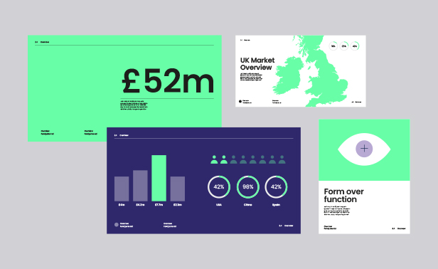
Colours provide a vast palette for designers to express creativity and communicate unique brand identities. Playful brands often utilise bright and unconventional colour combinations to stand out and convey a sense of fun, adventure, and innovation. Brands such as Spotify (green), Instagram (rainbow), and Nickelodeon (orange) use playful colours to capture the attention of their target audience and create a memorable brand experience.
Brand differentiation and recognition
In a saturated market, it is crucial for brands to differentiate themselves from competitors. By incorporating playful and vibrant colours into their branding, companies can create a distinct visual identity that sets them apart. The use of playful colours helps create a strong brand recognition and fosters a sense of uniqueness, enabling brands to connect with their audience on an emotional level.
Certain colours, such as deep blues and dark purples, are associated with authority, professionalism, and trustworthiness. These colours are often employed by brands operating in fields like finance, law, and technology to establish credibility and instil confidence in their audience. Confidence in branding can be achieved by combining these powerful colours with complementary hues that reflect the brand’s personality and values.
Conclusion
The power of colour in graphic design branding and brand identity cannot be underestimated. Colour psychology influences how individuals perceive, engage with, and remember brands. By strategically leveraging the psychological impact of colours, designers can create playful and confident brand identities that resonate with their target audience, elicit emotions, and foster lasting connections. Ultimately, the thoughtful use of colour can make a brand memorable, impactful, and successful in the competitive landscape of today’s market.