In the competitive world of food and drink, your appearance is only half the battle. Before a customer ever takes a bite, they “eat with their eyes”. This initial visual contact is where brand loyalty begins or ends.
How Design Agencies Elevate Food and Drink Brands
For a design agency, working within the culinary sector requires a delicate balance of visual appeal and strategic communication. Whether it’s the high-end, bespoke feel of a private chef’s identity or the shelf-ready look of a drink, every pixel and paper stock choice must serve a purpose.
The Psychology of Taste: Why Branding Matters
Branding in the food and beverage (F&B) sector isn’t just about aesthetics; it’s about managing expectations. When a consumer looks at a label or a website, their brain begins to simulate the experience. This is known as “cross-modal perception,” where visual cues trigger specific taste expectations before the product even touches the audience. Research from the Oxford University Crossmodal Research Laboratory suggests that visual elements like shape and colour can significantly alter how we perceive taste. For brands, this means that design is a functional ingredient in the product itself.
First Impressions and the “Halo Effect”
The “Halo Effect” is a cognitive bias where our overall impression of a brand influences how we feel about its specific traits. If a chef’s website looks polished and professional, we subconsciously assume their food will be on the same level. At FullSphere, we apply this by ensuring that Branding Services are deeply rooted in the brand’s core values. If a business claims to be “organic” or “artisanal,” the design must reflect that through its brand to build immediate trust.
Color Theory: Stimulating Appetite through Design
Colour is perhaps the most powerful tool in a food designer’s kit. You’ve likely noticed that many fast-food brands use red and yellow, this is because these colours are scientifically linked to increased heart rates and appetite stimulation. Conversely, culinary brands often lean into monochromatic palettes or muted tones to signal luxury and refinement. When we help a brand find its voice, we look at the competitive landscape to ensure they aren’t just following trends but setting a tone that resonates with their specific audience. With the Chef Charles Bryant Case Study our design strategy centered on his commitment to organic produce. By sourcing ingredients directly from his own allotments, Charles places quality at the heart of his craft. We mirrored this philosophy through a palette of earthy beiges and forest greens, evoking a natural, grounded feel that reflects his deep respect for the land and the ingredients he serves.
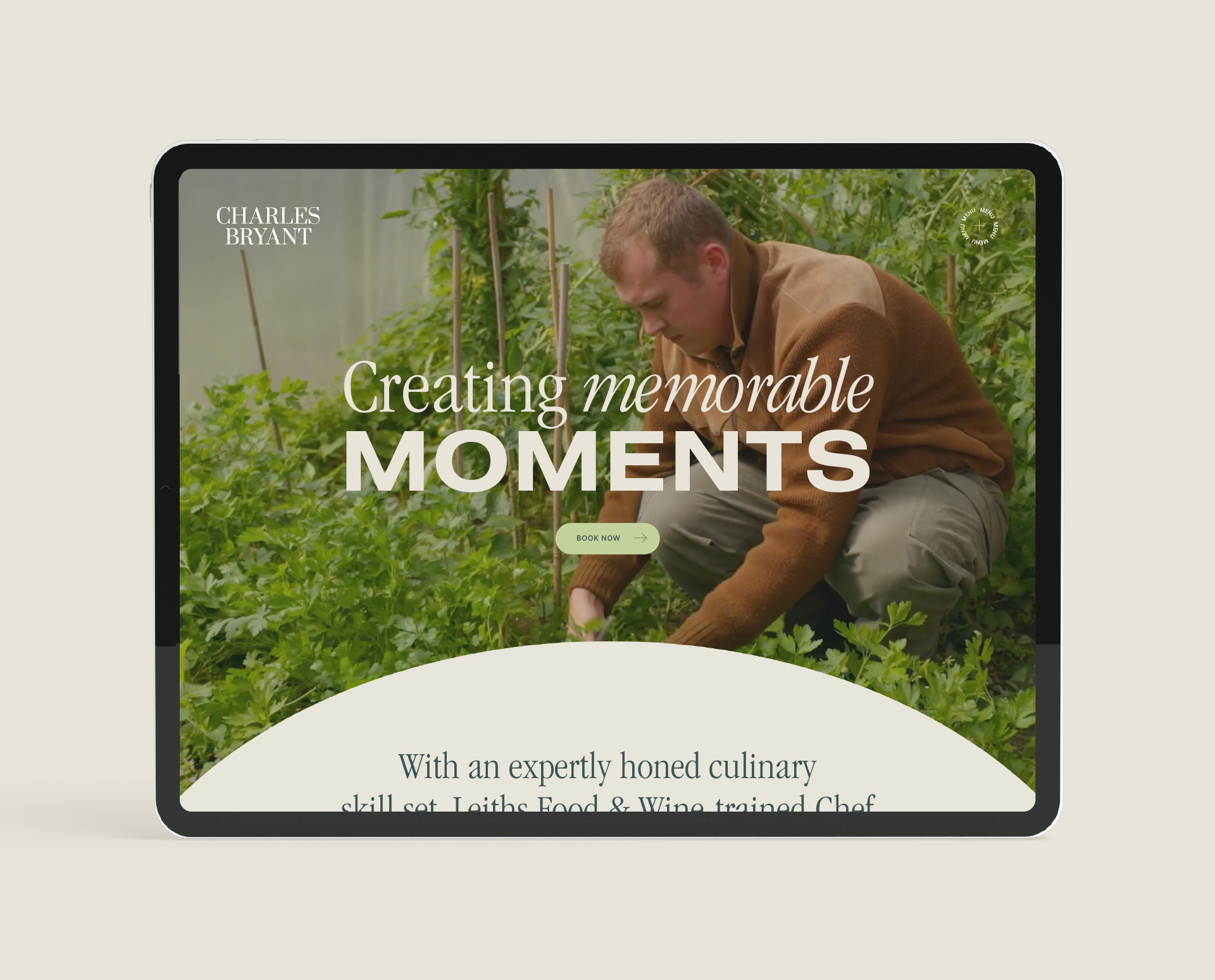
When designing for a private chef, the brand isn’t just a business, it’s a person. Chef Charles Bryant came to us needing an identity that mirrored his culinary philosophy: modern, fun, fresh and deeply rooted in quality of organic produce. Our work on the Charles Bryant branding project focused on the concept of “new luxury.” In the premium food sector, shouting the loudest isn’t the goal; demonstrating taste is.
Chef Charles Bryant encompassed both the precision of fine dining and the casual energy of pop-up lunch sessions, the design had to bridge the gap between traditional techniques and contemporary styles. We achieved this balance through a mixed typography system, blending classic and modern typefaces to reflect that culinary versatility. By harmonizing these psychological cues with functional packaging and a robust digital identity, design becomes more than an aesthetic layer; it becomes a fundamental driver of brand resilience. In an oversupplied market, the brands that endure are those that utilise design to clearly define their purpose and earn consumer trust at every point of contact.
Balancing Sophistication with Approachability
The challenge with luxury branding is avoiding a “cold” or “unreachable” feeling.
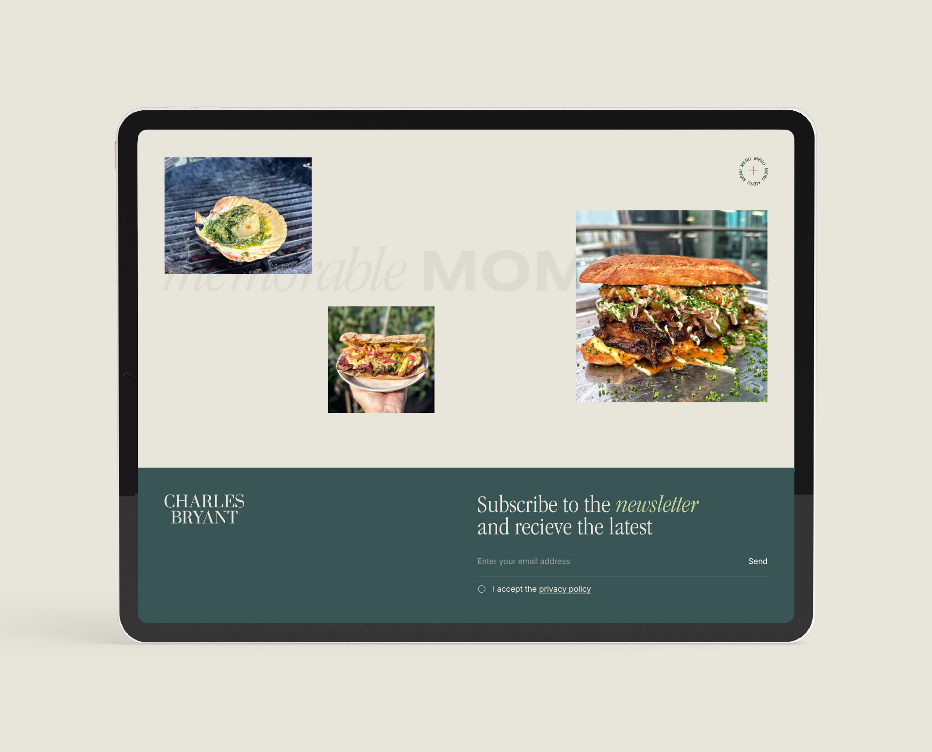
This balance ensures that potential clients feel they are hiring a master of their craft. By using a monochromatic colour scheme, mostly deep greens and beige, we allowed the vibrant colours of his actual dishes to take centre stage on his custom-built website.
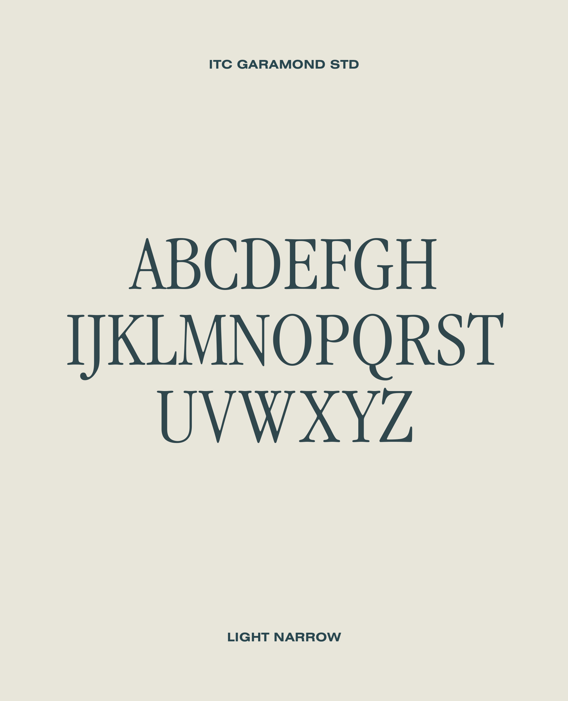
While imagery often takes the lead, typography is the silent anchor of brand identity. For a food or drink brand, font choice is a strategic decision that communicates heritage, price point, and personality before a single word is read. For Chef Charles, we utilised a serif-heavy typography that evokes a sense of heritage and timelessness, while maintaining clean lines that feel modern.
- Serif typefaces are frequently employed for premium or artisanal brands to evoke a sense of tradition and established quality
- Minimalist sans-serifs project modern efficiency and transparency, often favored by health-forward or tech-integrated culinary ventures.
The goal of specialized design is to ensure that the visual weight and structure of the text align perfectly with the brand’s positioning, creating a cohesive narrative that guides the consumer’s eye across the label or menu.
Digital Presence: Building Post-Purchase Loyalty
A brand’s journey continues long after the initial encounter. In the digital space, design agencies create immersive ecosystems from mobile-responsive websites to cohesive social media aesthetics that maintain the brand’s professional “polish”.
Effective digital strategy uses consistent visual cues across all platforms to build long-term recognition. By integrating professional photography and strategic UX (user experience) design, agencies ensure that the transition from a social media ad to a website checkout is seamless, reinforcing trust and encouraging repeat engagement without relying on aggressive sales tactics.
The Tangible Impact of Strategic Branding
A successful brand is measured by its ability to convert visual appeal into sustained commercial demand. For Charles, the strategic branding didn’t just create a “polished” look it established a level of professional trust that has translated directly into a packed calendar. By positioning the brand as both an expert in fine dining and an innovator in the pop-up space, we helped create a loyalty where clients feel a personal connection to the chef’s unique culinary narrative. This dual-market positioning has proven highly effective; his pop-up sessions have become highly sought-after, sold-out events that demonstrate the power of exclusivity and experiential branding.
Conclusion
Elevating a food or drink brand requires an agency to look beyond the immediate visual and understand the underlying strategic drivers of consumer behavior. This was a central focus in our work with Charles, where the brand identity was built around his concepts and goals. Navigating the space between the precision of fine dining and the accessibility of pop-up lunch sessions, the design strategy bridged traditional techniques with contemporary culinary styles. Fine dining can sometimes look old, dated or even pompous, everything that Charles is not. We opted for an honest down-to-earth approach to this culinary branding while at the same time staying true to core concepts of the business.